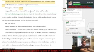
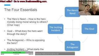
Edit of Ozma and Stuck in Silence
Just wrapped up a late night edit of Ozma and Stuck in Silence. I've written a few takeaways below, and as always, if you'd like to get one of our edits, let us know.
The takeaways:
Keep your intros simple. An intro that is almost a mini story with minimal other plot threads starting can help you focus on the character and drama more!
Interiority is key in prose. Be sure to treat your character's thoughts like another stream of dialogue. Give it voice and sass.
Make your character clever. A clever character is always fun to watch and be around. Don't be shy about creating characters that love solving problems and triumphing over their deficiencies through ingenuity.
Here's the video:
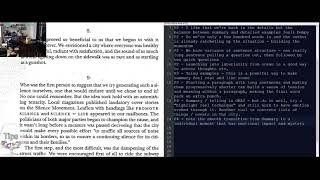
The Line-by-line Notes:
OZMA NOTES
P1 - Shorten the big wall o' text at the beginning P1 - Wouldn't worry about calling out the Focal Point P1 - Lean out char description here P2 - the murder of crows play on words is tough since it is depenent on your written description P2 - A complicated handshake works --> Beware these sequenced lists they seem to be a bit of a habit and will kill the reader with details P2 - use the montage formatting listed in "Screenwriter's Bible" P5 - Feels like a lot of worldbuilding and a bunch of unconnected moments tied in together consider trimming and focusing on completing the "newspaper" thought before nesting others P7 - Exposition is starting to show through - add conflict that has punch and trim back exposition. P8 - I feel like the story is really picking up here - getting the momentum and I like Tip's crafty character. P9 - Want to start seeing the arc of the story here - I like that Tip's plan backfires, but I really want to see it hurt the main goal, but it's hard cause I don't know it.
OVERALL: GOOD: -Tip's character is super well developed - I like his craftiness and clever ness in solving problems -World buildling is well done, and creative, but be sure to focus first on story
IMPROVE: -If you need the exposition, bring in more conflict, but you most likely don't need all that expo. -Clean up scene structure a little - some things felt kind of jumpy ie story shifted a lot and sometimes scenes would start with tons of description where others wouldn't.


